Our analytics dashboard is designed to help you to understand what is going on with your website and therefore, how you can make changes to marketing activity to increase conversions.
Here is an example dashboard for what a typical analytics dashboard looks like.
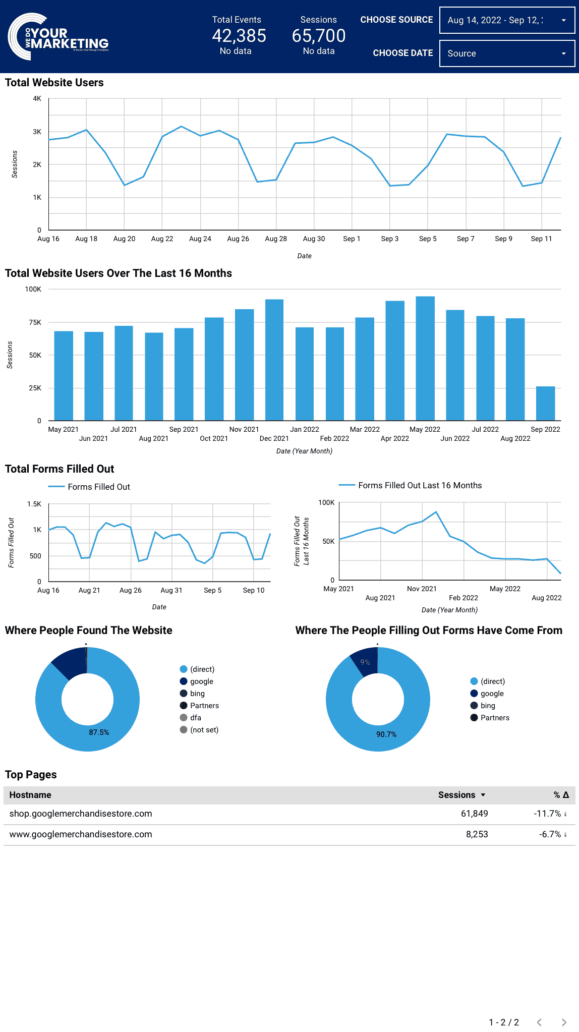
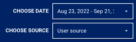
Here you can adjust the time period for which the website is being viewed.
Here you can choose where the traffic is coming from. The options here are Google, LinkedIn etc.
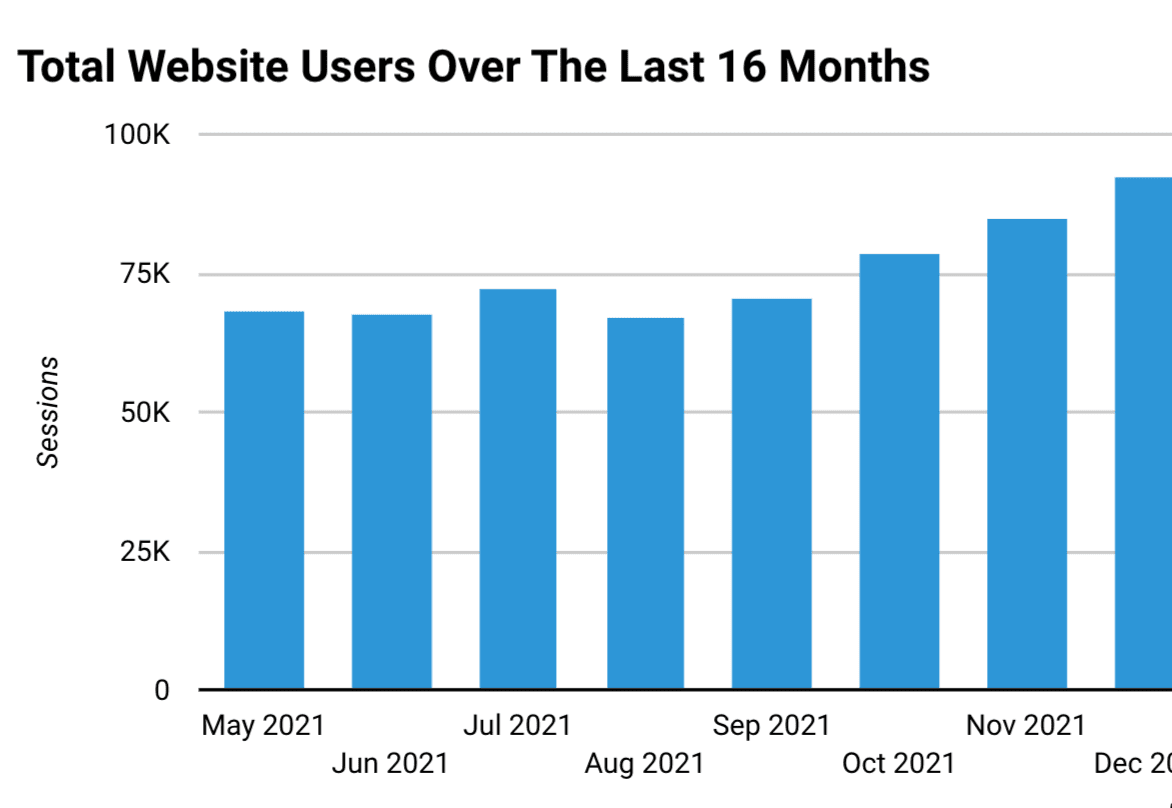
This is the graph of the exact number of people visiting the site within the time period set in the top right.
This information has many uses, such as tracking how well your marketing campaigns may be performing, following seasonal changes etc.
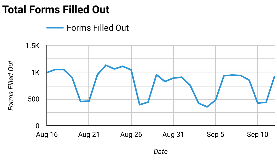
This is the graph of the number of forms that have been filled out within the time period set in the top right. This works through conversion tracking so if this is not configured correctly, then contact us and we can help fix this.
This is useful for seeing how effective marketing campaigns are performing and if they are targeting the right audience.
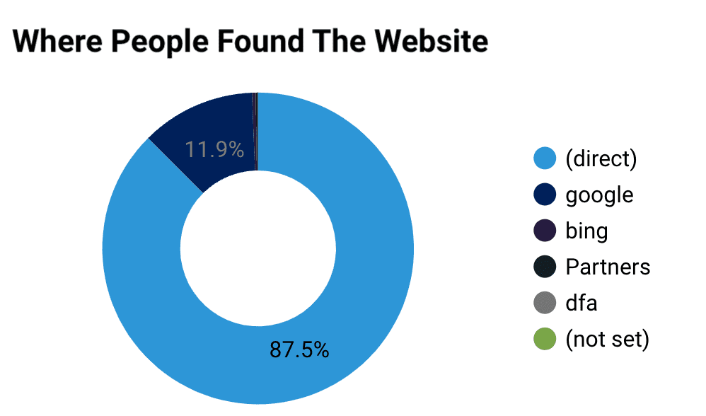
This is the graph of where people have found the website within the time period set in the top right.
Being able to see where your audience has come from is useful for knowing which channels are providing the most value.
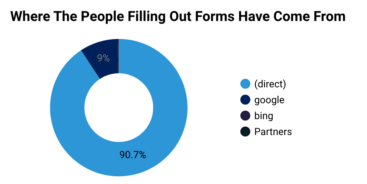
This is the graph of where people who are filling out forms within the time period set in the top right.
Being able to see where the people are filling out the forms tells you what is working well.
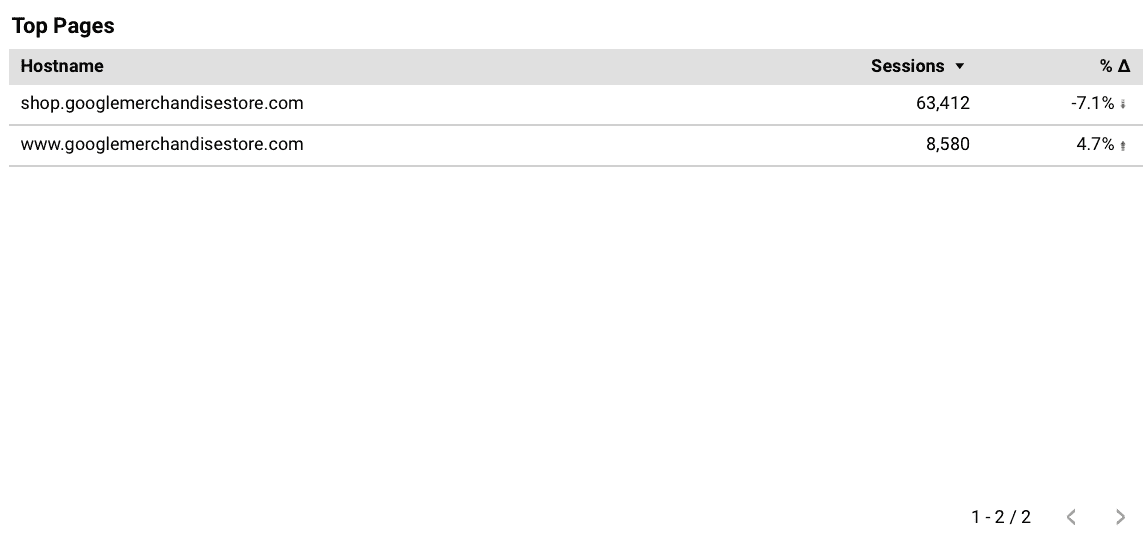
This is the graph of the most visited pages within the time period set in the top right. Use the buttons at the bottom right to scroll through different pages.